“A picture is worth a thousand words”.
With so much information being collected through data analysis in the business world today, we must have a way to paint a picture of that data so we can interpret it. Data gains more value as and when it gets visualized.
Data visualization in python is perhaps one of the most utilized features for data science with python in today’s day and age. The libraries in python come with lots of different features that enable users to make highly customized, elegant, and interactive plots.
Matplotlib
Matplotlib is an amazing visualization library in Python for 2D plots of arrays. Matplotlib comes with a number of plots such as bar plot, line plot, histogram, scatter plot etc.
Installation
If you have python and pip installed in your system installing matplotlib is very easy.
pip install matplotlibOnce matplotlib is installed import it using import matplotlib
The plot function is used to draw points(markers) in a diagram. The function takes in two parameters for specifying points in the diagram.
Parameter1 - array with points to be marked in the x-axis
Parameter 2 - array with points to be marked in the y-axis.
Eg: To plot a line connecting points (1,8) and (3,10), the function should go like
import matplotlib.pyplot as plt
plt.plot([1,3],[8,10])
plt.show()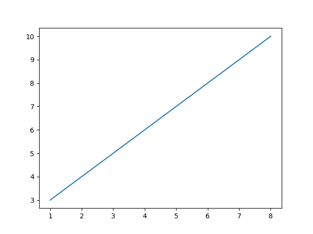
There are a number of options to play with the matplotlib library trying out different markers and plotting various numbers of plots the library offers. Exploring each one of them is out of the scope of this article.
Seaborn
Seaborn is a Python data visualization library built on top of matplotlib. It provides a variety of advanced visualization plots with beautiful default styles and colour palettes to make statistical plots more attractive.
The plots in the seaborn library can be divided into the following various categories:
Distribution plots: This type of plot is used for examining univariate and bivariate distribution.
Relational plots: This type of plot is used to understand the relation between the two given variables.
Regression plots: Regression plots are primarily intended to add an additional visual guide that will help to emphasize dataset patterns during the analysis of exploratory data.
Categorical plots: The categorical plots are used to deal with categories of variables and how we can visualize them.
Multi-plot grids: The multi-plot grids are also a type of plot that is a useful approach is to draw multiple instances for the same plot with different subsets of a single dataset.
Matrix plots: The matrix plots are a type of arrays of the scatterplots.
Installation
pip install seabornPlotting charts using seaborn library
import seaborn as sns
# loading dataset
data = sns.load_dataset("iris")
sns.lineplot(x="sepal_length", y="sepal_width", data=data)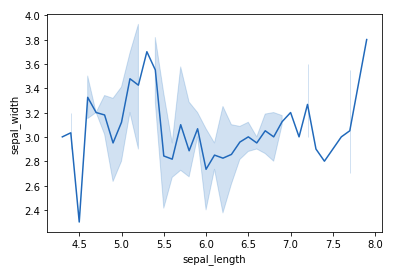
Bokeh
Bokeh prides itself on being a library for interactive data visualization. Unlike popular libraries like matplotlib, seaborn etc, Bokeh renders its graphics using HTML and JavaScript. It supports unique visualizations like Geospatial plots, Network graphs, etc. right out of the box. Bokeh has the option to export these graphs to show these visualizations in a browser.
Installation
pip install bokehPlotting graphs using Bokeh
To create a single line, the line() method is used.
# import modules
from bokeh.plotting import figure, output_notebook, show

# output to notebook
output_notebook()

# create figure
p = figure(plot_width = 400, plot_height = 400)

# add a line renderer
p.line([1, 2, 3, 4, 5], [3, 1, 2, 6, 5],
        line_width = 2, color = "green")

# show the results
show(p)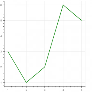
Plotly
Plotly is a helpful tool for data visualization and understanding the data simply and easily. Plotly produces interactive graphs, can be embedded on websites and provides a wide variety of complex plotting options. It offers hover tool capabilities that allow us to detect any outliers or anomalies in a large number of data points.
Plotly allows us for the endless customization of our graphs and also support animation capabilities as well. So, it’s a pretty useful library if you want to do storytelling through visualizations.
Installation
pip install plotlyPlotting graphs using PLotly
It has various types of graphs and charts like scatter plots, line charts, bar charts, box plots, histograms, pie charts, etc.
import plotly.express as px
df = px.data.gapminder().query("country=='Canada'")
fig = px.line(df, x="year", y="lifeExp", title='Life expectancy in Canada')
fig.show()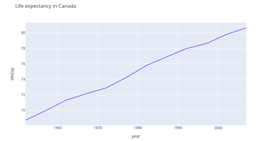
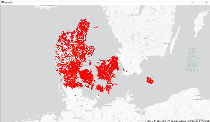
Geoplotlib
It is a Python toolbox for visualizing geographical data and making maps. Geoplotlib can be used to make a variety of maps, such as equivalent area maps, heat maps, and point density maps. And since it works on maps, the common input is Latitude as lat and Longitude as lon. Some modules supported by geoplotlib are:
- geoplotlib module
- geoplotlib.layers module
- geoplotlib.utils module
- geoplotlib.core module
- geoplotlib.colors module
Installation
pip install geoplotlibPlotting graphs using Geoplotlib
import geoplotlib
from geoplotlib.utils import read_csv

data = read_csv('bus.csv')
geoplotlib.dot(data)
geoplotlib.show()